
It may look easy on the surface, but choosing the right colour scheme for your brand can be a tricky process. It’s easy to feel overwhelmed by nuances such as colour psychology, the colour wheel, hues, tones, etc., etc., particularly if you’re not a designer.
Just how important is colour choice, though? Consider this: studies have shown that colours can affect our mood, appetite, and even our perception of time. It was also found that, on average, people make a judgment about a product within 90 seconds, and 62-90% of that judgment is based solely on colour. In other words, colour is very important.
This post will explain four basic rules to help you put together an effective, on-brand colour scheme.
Less is more
Simplicity is key in design, and this applies to colour schemes too. Using too many colours can make it difficult to create a balance. As a general rule, 3-5 colours should suffice for a brand palette.
Start by choosing one or two focal, primary colours and balance it out with accent colours or neutrals such as grey and black.
Another good way to keep things minimal is to choose one colour and use tints and shades (darker and lighter versions) of that colour as accent colours.
Consult the colour wheel
Learning how to use the colour wheel is a good starting point for putting together a palette that doesn’t clash. There are four main types of colour scheme: analogous, complementary, monochromatic, and triadic.
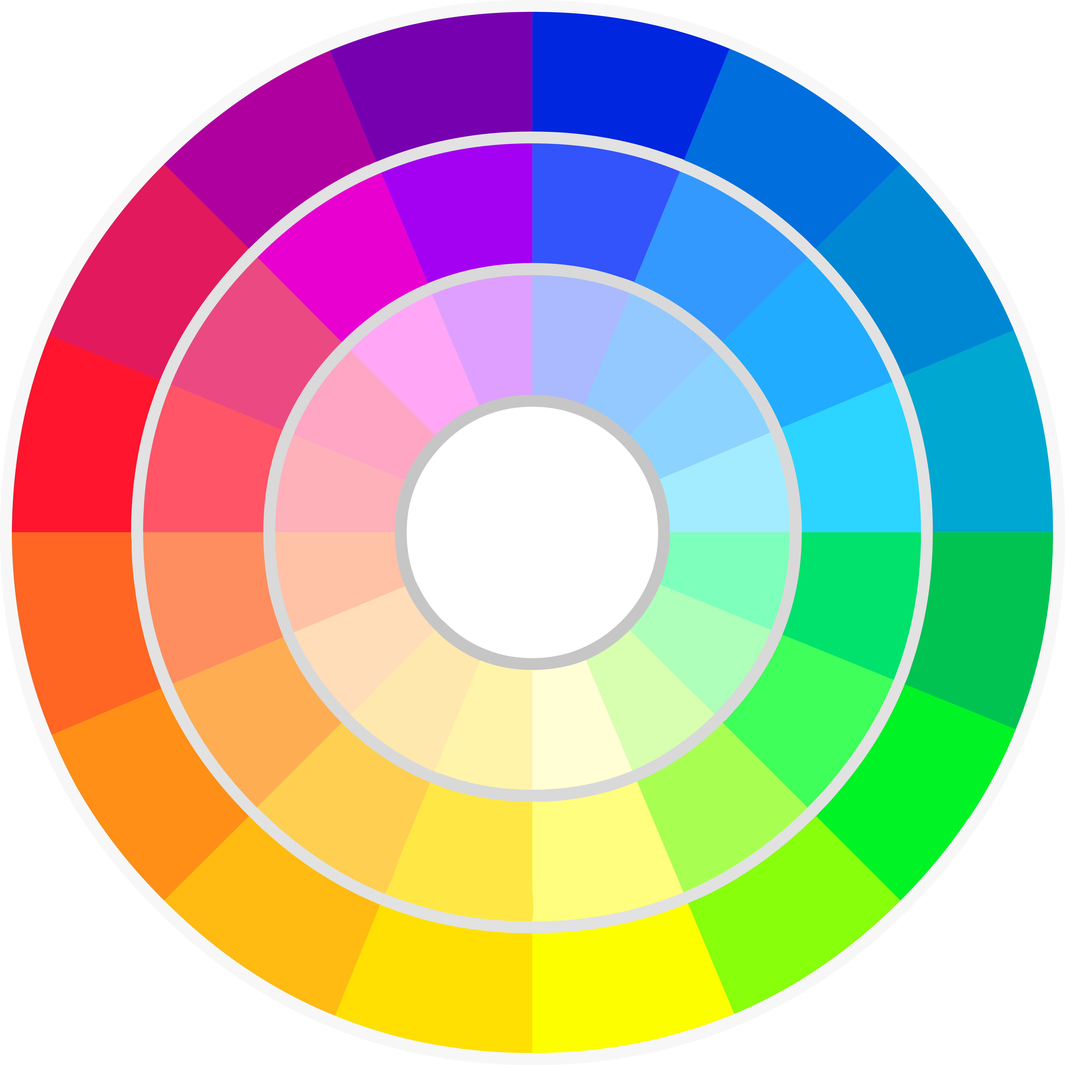
An analogous colour scheme contains colours that are next to each other on the colour wheel, such as orange, yellow, and green. Moving towards the centre of the wheel, the colours are the same hue but a different shade (Hue+Black). Moving away from the centre of the wheel, the colours are the same hue but a different tint (Hue+White).
Complementary colours can be found directly opposite your chosen colour on the wheel, in the same tint. Blue and orange are a good example of complementary colours.
A monochromatic colour scheme contains a single colour in different shades. Pick a hue and select different shades by moving away from or toward the centre.
Triadic colour schemes are made up of three colours that are located equidistant from each other on the colour wheel, such as red, yellow, and blue.
Use psychology
Colour psychology is a field of study that explores how colours affect us, psychologically and physiologically. Understanding how colours affect our emotions and responses is key to selecting the most appropriate colour scheme to match your brand’s identity and message.
Blue, for example, invokes feelings of serenity and calm and is often used by law firms to communicate security and stability. A quick Google search brings up many charts explaining the psychology of colour, and the specific emotions and reactions different colours can trigger. Come up with a list of keywords that best describe your brand’s message, and use these charts to find colours associated with those keywords.
Keep in mind that when it comes to emotions there’s no “one size fits all”. We can’t definitively say that everyone considers green a calming colour, for example. So colour psychology shouldn’t be followed too strictly, rather used as a general guide.
Look for inspiration
Pinterest boasts a plethora of themed colour palettes, and they’re easy to find with the right keywords. One heavily-featured resource on Pinterest is Design Seeds, a website created by former designer Jessica Colaluca which offers a wide range of colour palettes. Browse collections such as summer, rustic, and edible, or select one colour and search for palettes featuring similar colours.
BrandColors is another great source of inspiration. This website hosts an extensive gallery of colour schemes used by the world’s best-known brands, complete with hex codes.
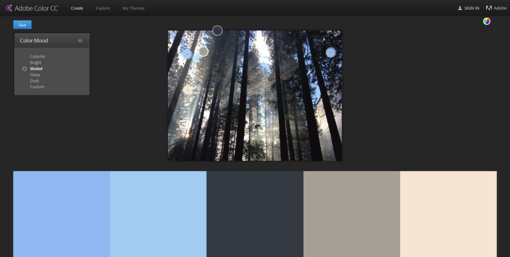
Besides these tips, there are a lot of tools available on the web to help you put together a great colour scheme. One handy feature a lot of these tools have in common is the option to upload an image, which the tool then uses to generate a matching colour scheme. Adobe’s Colour CC even lets you define the tone of your palette with options such as Bright, Muted, and Deep.
Chrome users can install Eye Dropper, a cool open-source browser extension that lets you pick colours from the web.
You must be logged in to post a comment.